In attempts to be environmentally-conscious, we chose to distribute all of our wedding communications via email and our website. Furthermore, not a lot of couples have careers as an interactive developer and software engineer, so we felt we had to take advantage or our technical skills to create a fun wedding website (or “WEDsite” as Lovestru.ck likes to call them).
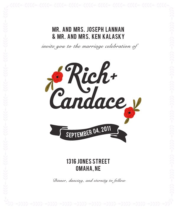
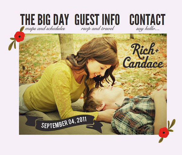
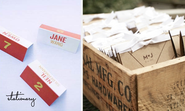
I incorporated our wedding color scheme, typography and design elements into the wedsite to make it cohesive with our other wedding stationary and decor. I designed the wedsite to give our guests a sneak peak of what to expect from our wedding and provide them with any pertinent wedding information.

Home Page
Once I had finished the design, I developed the website’s functionality. Our wedsite doesn’t have a traditional layout. The navigation links direct the user to the different sections of the website on one giant “page” rather than a bunch of separate pages.
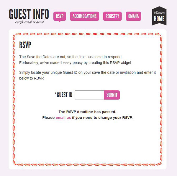
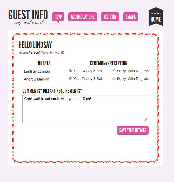
One of the coolest features of our wedsite is the RSVP widget. We created a database of all of our wedding guests and assigned them a unique ID that was emailed to them with their save the dates. Our guests used their ID to login and RSVP for our wedding. You can view the RSVP widget by clicking on the “Guest Info” link on the home section.

RSVP Page
You can use my sister’s ID (6712) to see how the widget works. Once our guests filled out the form, their information was saved in our database, so we could easily see who could attend and how many people would need special meals from our caterer.

RSVP Results
Wedsite design and development is included in Lovestru.ck’s a la carte services (the Lovestru.ck website will be up this weekend for you to view all of our design and planning services). I look forward to sharing more personalized client wedsites with you.


