Lovestru.ck Website Redesign
I have been working on updating our website and brand image for the past few months. I knew we needed a fresh and sophisticated logo and website that would compliment our design style and the experience we provide our clients. I’ll post more about our new logo in the next few weeks, but I wanted to share the new features and look of our website with all of your first.
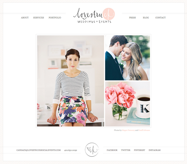
I wanted to website to look clean, natural, and feminine. Here’s an image of the homepage:
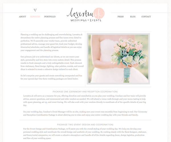
Our services page includes all of the information about our new wedding packages.
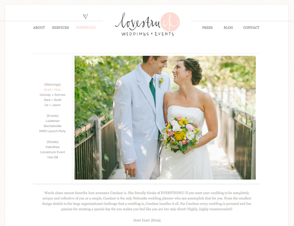
I love our new portfolio page too. It includes images of some of our favorite projects as well as testimonials from our clients.
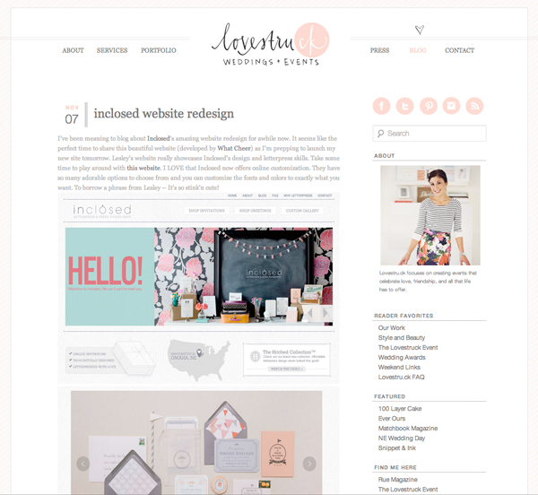
Our blog needed a lot of work. I wanted to include more social media interaction, so I added the Instagram feed on the sidebar and Pinterest hover buttons on all of the images.
Please explore the website. We hope you like it!


Katey
November 8, 2012 at 11:48 pmLooks great 🙂 love the new design.
admin
November 9, 2012 at 12:20 amthanks Katey!!
megan hunt
November 9, 2012 at 2:08 amcandace, it’s GORGEOUS!
Jenny Rawson
November 15, 2012 at 9:59 pmCandace, I’ve been meaning to tell you that I love your new design. Fits you and Lovestruck perfectly. 🙂 I’m dropping by your office tonight to meet with Jessica – crossing my fingers you’ll be there, too!