The New Lovestru.ck Branding
As I was designing our new website a few months ago, something wasn’t working as I played with the design in photoshop. I realized our logo didn’t match the new style/aesthetic I was trying to achieve with the website and the Lovestru.ck brand as a whole. I loved how the logo looked like a signature (the “ck” in Lovestru.ck stands for my initials), but it felt bulky and a little too whimsical. With the help of Liz White and the amazing hand-lettering skills of Lauren from A Fabulous Fete, we came up with the logo/patterns/colors seen above in our brand board.
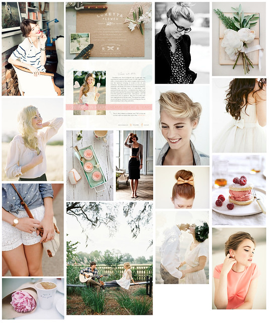
I’m incredibly happy with the end result, but how did we get there…? The process is actually very similar to how we design weddings and events. This past summer as I was dreaming of the new website and collateral for Lovestru.ck, I developed a mood board (see below). The board includes images with specific examples of color and design as well as images that evoke the fresh, sophisticated, feminine, and natural mood/feelings we want to achieve. By comparing every design to our mood board, we were able to make sure the final logo was consistent with our new brand.

Row 1: 1 /
2 /
3 /
4
Row 2: 1 /
2 /
3 /
4
Row 3: 1 /
2 /
3 /
4 /
5
Row 4: 1 /
2 /
3 /
4


Sorry, the comment form is closed at this time.